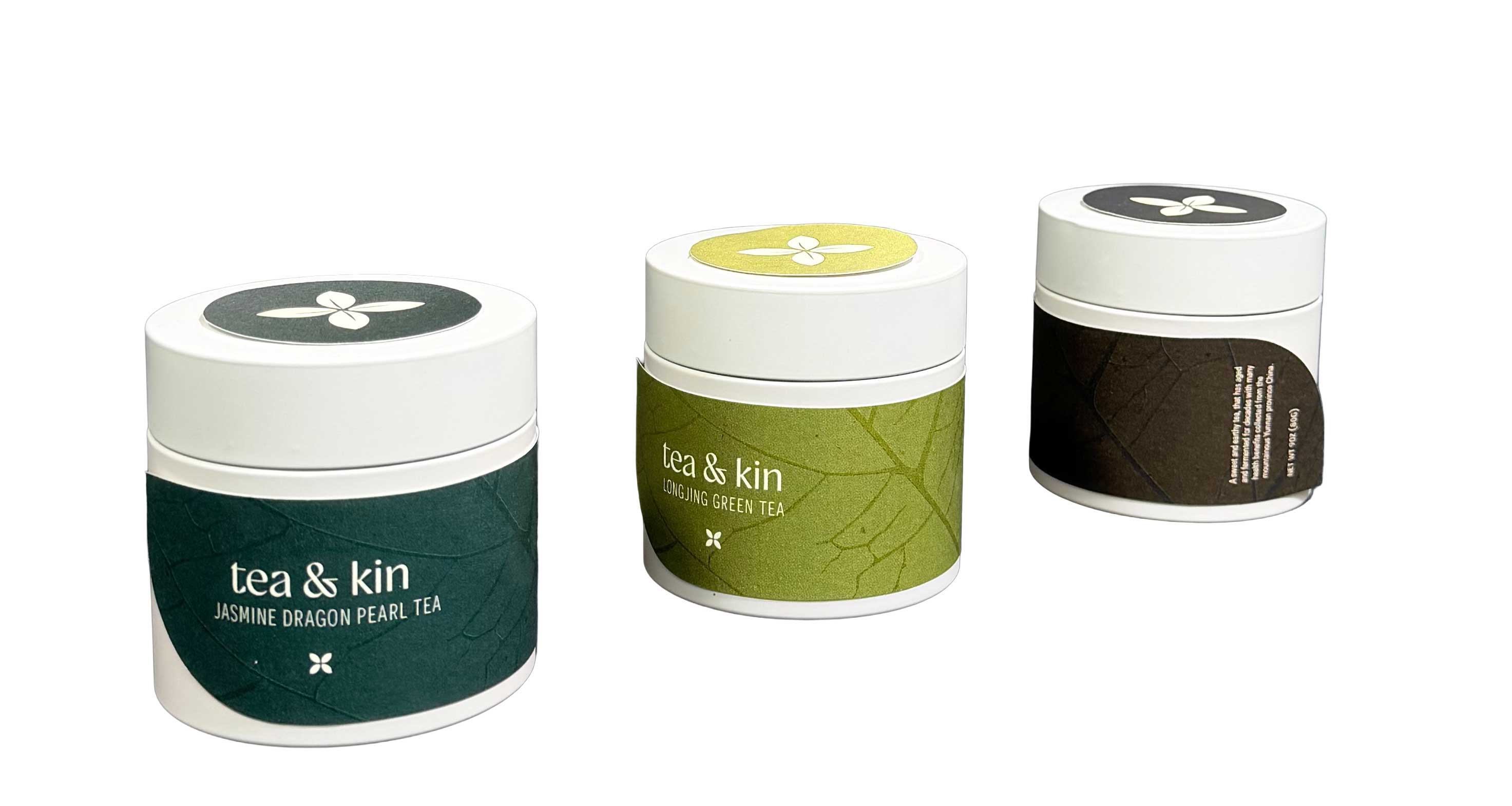
tea & kin
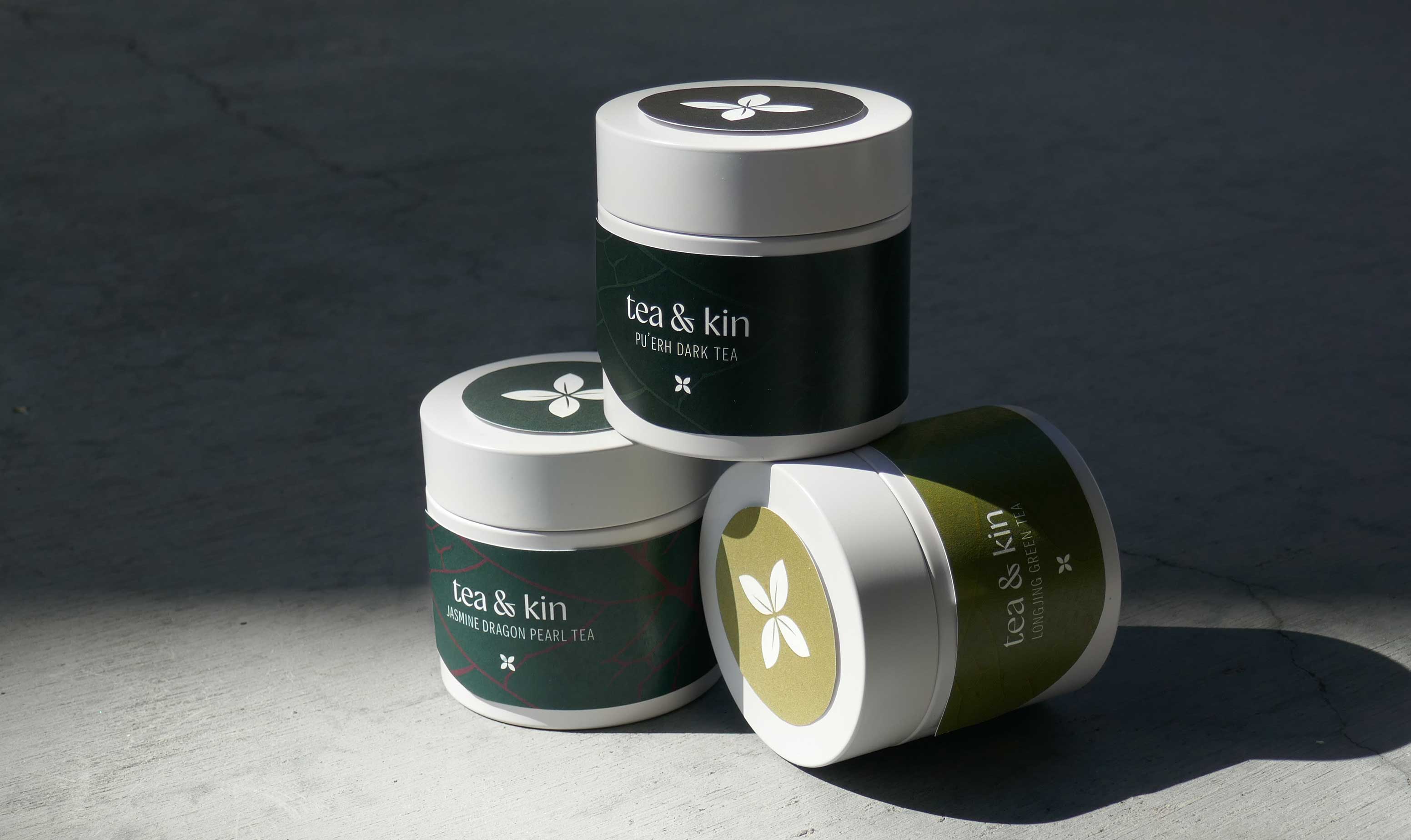
Tea & kin is a packaging project for a Chinese loose leaf tea brand focused on quality and the connection that tea brings for people. Tea has become a bridge between cultures and people, bringing kinship.
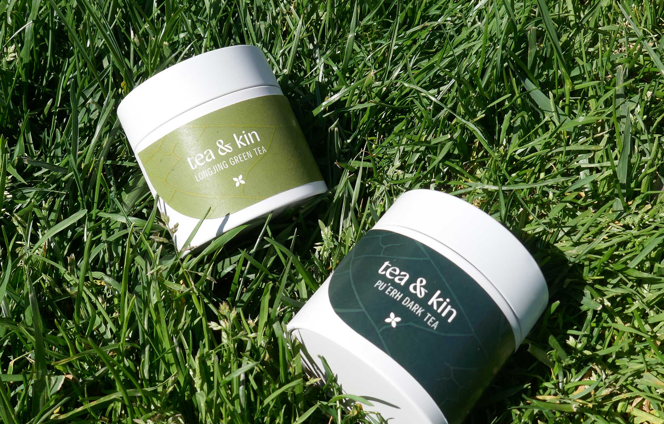
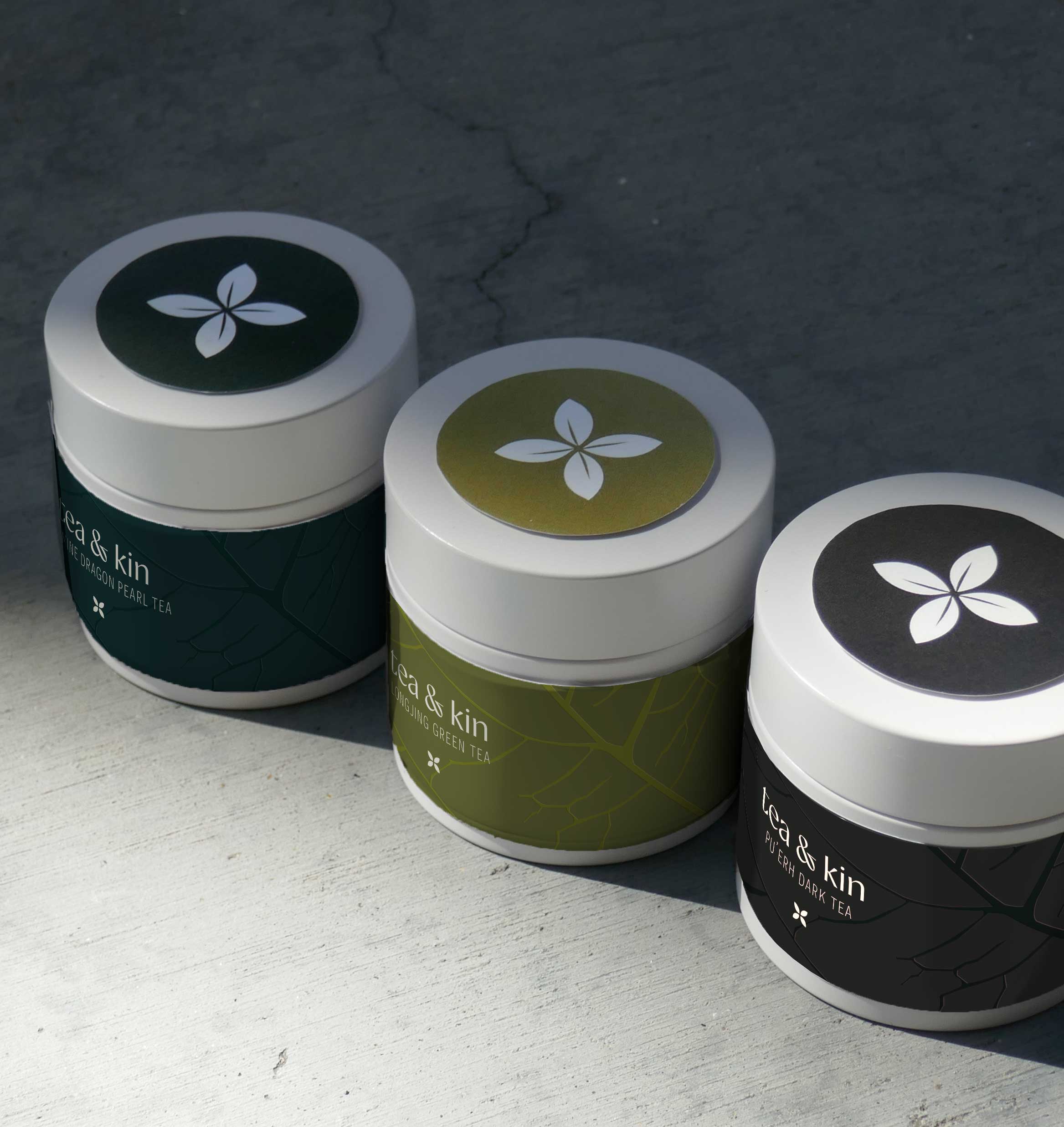
Drawing inspiration from the product itself, the label resembles a leaf both in shape and with pattern. Each tea is distinguished by its color, consisting of colors from the forestry and mountainous landscape that the leaves came from. Tea & kin is a brand that captures the authenticity of its origin in a unique way.
SCOPE
Packaging Design
TOOLS
Illustrator, Photoshop, Cricut
YEAR
2026
© 2026 Audrey Tu. All Rights Reserved.
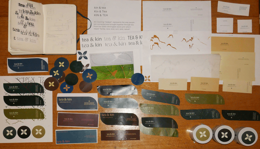
PROCESS
I played with different typefaces and different treatments before starting on the label itself. One direction that I was very committed to for about half of the project was embossing the landscape of the different Chinese regions that the teas came from across the label. I learned to do this by hand with an x-acto knife and paper, essentially pushing the pattern through. Although I was attached to the concept, that didn’t stop me from exploring new avenues, which is how I came to the final design, with the leaf pattern. The process of this project taught me a lot about different craft and print treatments for physical packaging.